Airtime Pro's got a new look

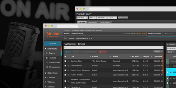
Today, we’re excited to unveil a redesigned interface for Airtime Pro. This new interface brings a sleek new look and reorganised layout to your station that makes powerful features like the Smart Block Editor easier to use.

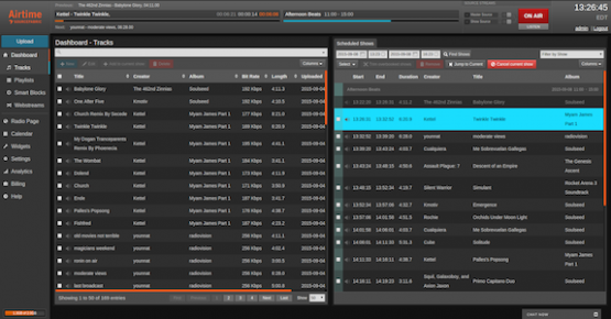
The new Dashboard layout in Airtime Pro
We transformed the Now Playing screen into a Dashboard view that allows you to schedule tracks and manage your library more efficiently in a single view. We also made the layout more intuitive, consistent, and responsive across more screen resolutions and devices.

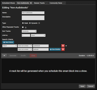
Dynamic tabbed Smart Block Editor
This update also lays the foundation for some exciting new features we’re planning to bring you over the coming months. We’re not quite ready to unveil them just yet, but when we’re finished, they’ll form part of our next open source release, Airtime 3.0.
At Sourcefabric, we’re committed to empowering independent media through open source, and we intend to continue helping independent radio around the world by releasing this powerful new version of Airtime to the community next year.
Summary of changes
-
The new, streamlined interface makes it easier to find and use some of our best features like the Smart Block Editor.
-
The Dashboard view offers a powerful tabbed editing interface allowing multiple playlists to be edited more easily within the workspace.
-
The Upload page now allows you to drag and drop an entire folder of tracks from your computer to be uploaded.
-
The update includes dozens of usability enhancements and a new layout that offers a better experience across more screen resolutions and devices.
We've prepared a short tutorial explaining these changes for you. Enjoy watching it!
Are you looking to further streamline your broadcasting workflow or distribute audio on other platforms? Let us know what you’d like to see next from Airtime Pro on our Facebook page or Twitter! Interested in running your own internet radio station? Sign up today for a free 30 day trial of Airtime Pro!
